The Red Sink: Creating Visual Reminders at Your Dealership
Setting your dealership apart visually can make for memorable customer experiences.
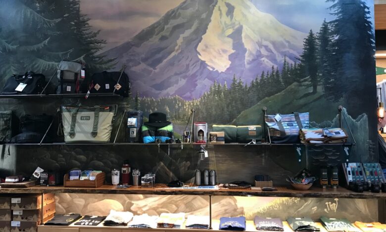
Every time I go into an RV dealership or parts store, my first thought is, “What sets this apart from all the other RV stores I’ve been in?” I’m always hoping for a visual reminder of where I am other than a bunch of RVs sitting on the lot, with the parts desk visible and the accessories area as a crowded afterthought inside.
A few years ago, I was in an elegant tile showroom in southern Oregon. I had been hired to give a seminar to tile/stone/marble retailers and was on a fact and photo finding mission. After I walked around the store, the store’s manager, Shawnette Blank, gave me a tour of their restrooms. Now, normally I would have made that trip on my own as I had a long drive back up north to Portland, but I immediately understood why she was so proud of the three restrooms. They were truly fabulous! They were a combination of great tile work and creativity. Blank told me the rooms were her store’s “red sinks” and went on to explain that every store, in every category, needs a red sink – a visual “wow” that a customer will remember long after leaving the store.
What is your red sink? What sets you apart visually from your competitors? It’s most definitely not your rows of gondolas. Knowing that you can get an idea that’s “great, cheap and easy” maybe once in this lifetime, I had to look beyond getting all three at once. Most great things take some effort, time or money – or all three. But having a memorable image can drive a customer back to your store – 80% of a memory is from something we saw and retained.
I hope the past couple of years have been good for you. Covid got people looking for alternative ways to live and for many, the RV business boomed. Once it was “under control,” people started to go back to old patterns, including not wearing masks. As a new wave of the flu is predicted, let’s hope it doesn’t impact your business in a negative way – including receiving parts and accessories in a timely manner.
If you haven’t updated your showroom or accessories area in more than a couple of years, it may be starting to feel dated and faded. As you know from other aspects in your life, all things change, grow or die. Covid-related great business is not exempt from that rule. Consider adding a “red sink” to your showroom now, while money is (hopefully) flowing.
A memorable visual can be in a window, free-standing, on a high wall or hanging from a high ceiling. It can also be in a focal area where people walk through your front door. It always makes sense to shine some light on it, so your time, money and effort don’t go to waste. Adding a few LED spotlights may be out of your budget after you create your red sink, but plan them into the budget from the start – it won’t hurt so much once the compliments start pouring in. If your red sink visual is in your front window, have one or two LED spotlights shine on it from the window wall. Have the 2-foot or 4-foot track attached to the wall and make sure the lights are pointed on the face of your display – not over the top of it. When the front of the display is well-lit, people can see it from the street. An overhead light is a wasted light.
When you put the effort into adding something fun and memorable to your showroom or accessories area, your customers will talk about it and spread the word. RVers communicate with one another, and you want your company name in their conversations in a positive way.
Years ago, the owner of a garden center in Westport, Connecticut, kept a large cage with his very talkative and friendly parrot inside. People adored the bird and brought their children to hear the bird sing and chat with them. It was a memorable experience. Of course, this only works if someone has a bird that they are willing to share with the public (and the bird’s vocabulary isn’t particularly salty). Also, that person ideally will be with your company for a long time.
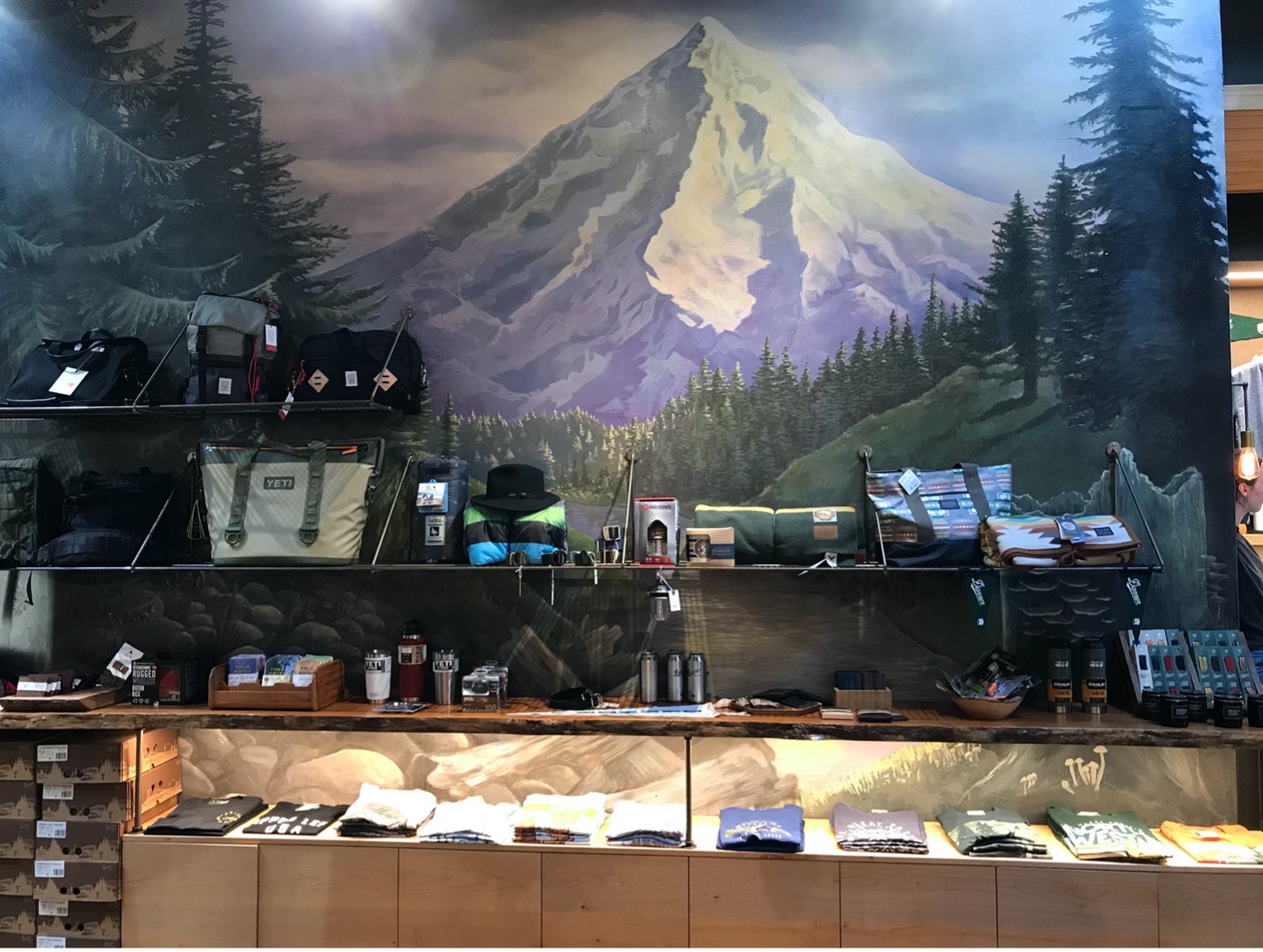
Example No. 1:
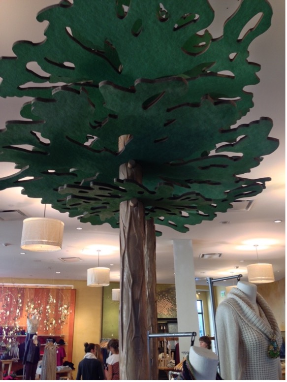
Example No. 2:
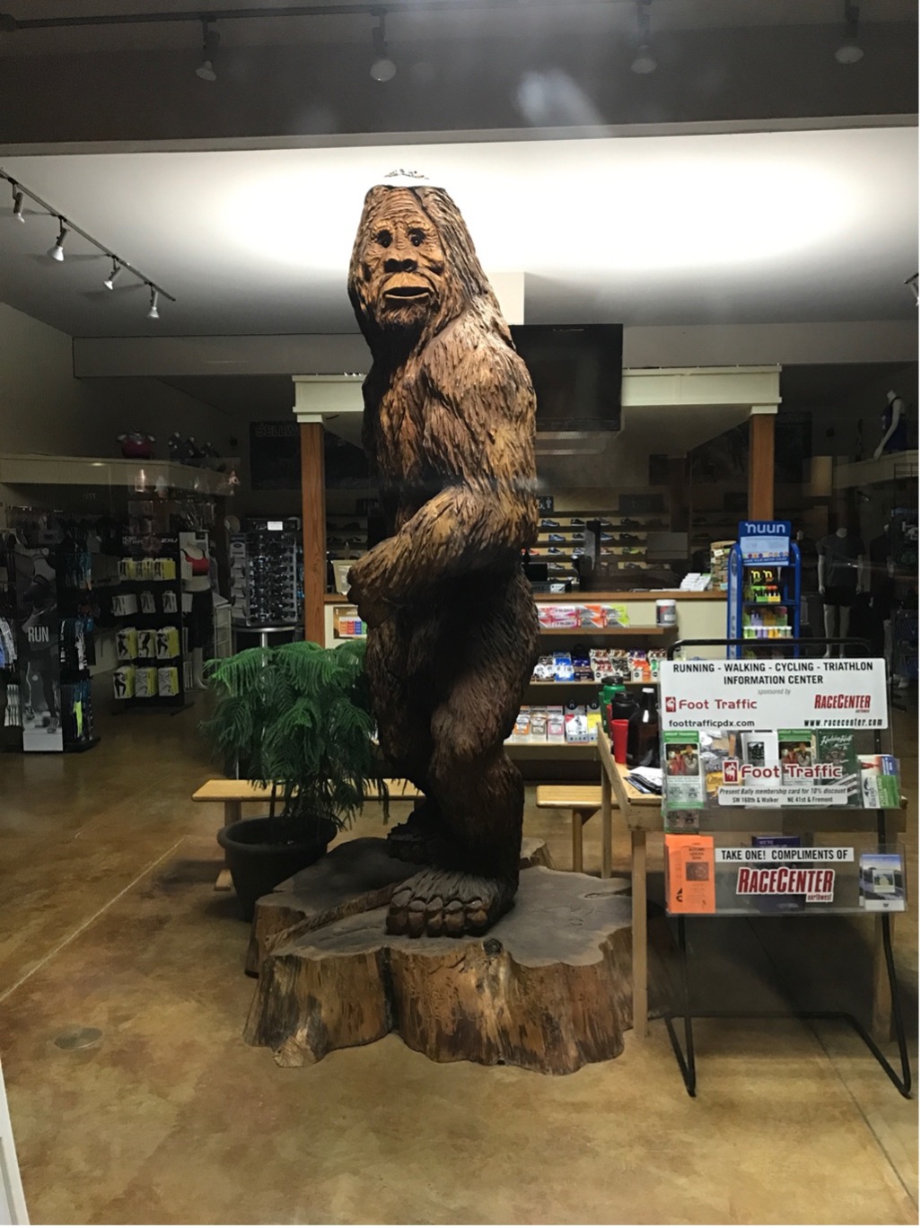
Example No. 3:
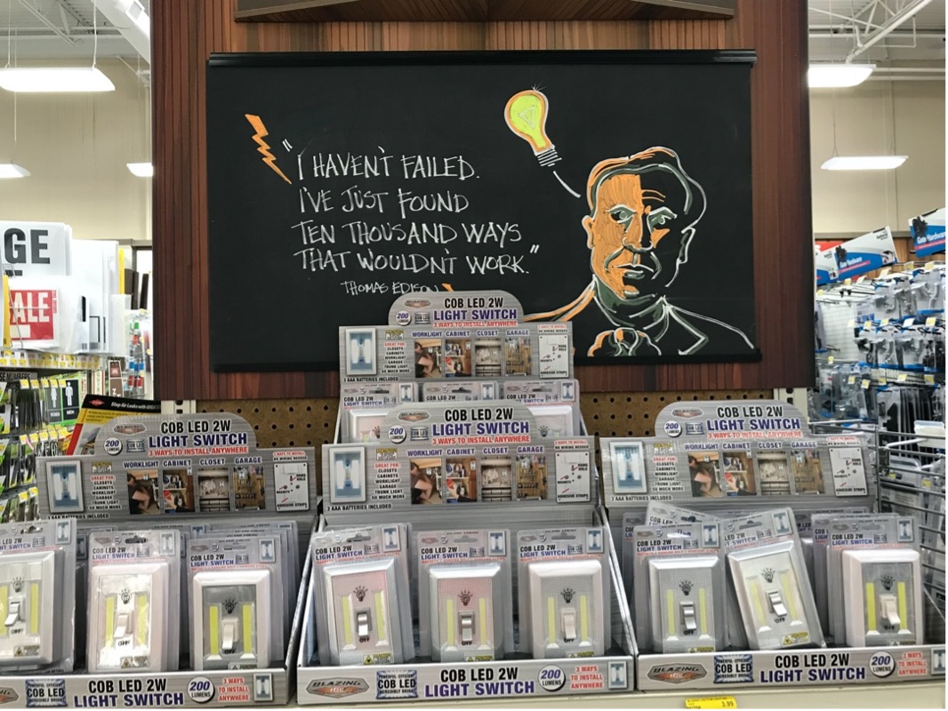
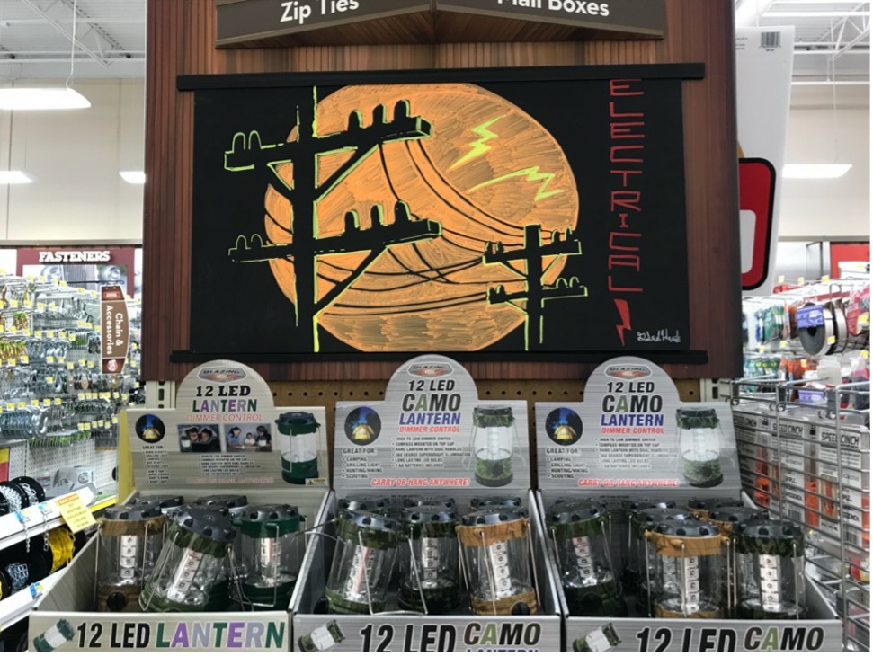
Instead of one big focal display, if you have someone creative on staff, consider reworking all your endcaps. Parkrose Hardware in Portland had a guy on staff who was very creative and artistic. They asked him to have fun with the endcaps and provided him with chalkboards and chalk paint markers. I enjoyed walking around the store, looking at the art and how it highlighted the products below.
Example No. 4:
