The Rights & Wrongs of Point-of-Purchase Displays
How your dealership can use POP displays to entice customers to shop.

There are vendor displays that sell well – and then there are those that just look awful! Sometimes they do both. Point-of-purchase (POP) displays are designed to promote the vendor and their products – not your dealership or store. If you have a visual identity in place such as fixture and wall signs that tell customers where to find something, strong POP graphics may override your signage. Too many POP displays in your parts/accessories area can create visual confusion and make the area look and feel cluttered.
The solution is to spread them out, if possible. The more POP displays a customer sees on a shelf or on the floor, the less information that customer will absorb. Too many different shapes and colors can camouflage individual gems.
Is less POP more – or less? It depends on the quality of the fixtures, how many you have, and if they are stocked well or empty. Scan your store from the front door moving your eyes from left to right. If all you see are POP fixtures, you may have too many.
If you’ve waited on a check-out line at a Best Buy you’ve found yourself in the impulse buying aisle filled with smaller “pick-up” items that you didn’t think about but now find you absolutely must have. Most of those items are in POP cardboard containers. Cardboard boxes can downgrade the perceived value of whatever they contain. The containers fabricated out of acrylic or metal make their merchandise look more expensive and the perception is that items in a better-quality display will last longer and work better.
Colors, Fonts & Lighting Matter
Temporary POP displays tend to be the most offensive abusers of taste. They are often made from cardboard or another lighter weight and easily disposable material. They may have strong graphics with bright colors and feature seasonal products or special promotions. They are often either countertop displays or freestanding floor displays. On a counter or gondola shelf their unfinished cardboard backs are not easily seen. On the selling floor, ideally their backs should be turned so the blank material isn’t seen by customers.
I visited my local Camping World to discover POP displays that worked well and some that were not so great. The ones that worked best were vendor provided floor and endcap displays. The best endcaps included Tire Minder which had a lime green metal box with squared-off dimensional sides. The lime green has a lot of yellow in in making it bright and eye-catching while the dimensions give the feeling of quality. This box has a clear plastic locking door to protect the higher priced merchandise. The information about the TireMinder i10 and the Smart TPMS is on a tilted white board. The explanatory signage is black on a white background making it easy to read for people of all ages. Contrast is key when delivering a message!
Dish TV had an excellent endcap display as well. Once again, a tilted product and informational area made it easy to see without bending down. They offered Step One, Two, Three in graphic form so customers could see and understand how to buy, install, and use Dish. Their corporate color identity is black, red, and white and they used it throughout the POP endcap. A large QR code was at eye level. QR codes are becoming more common and comfortable for people to use.
Flex Super Glue had a smaller, printed cardboard endcap display that worked great. Their color theme; red and yellow stood out from the surrounding darker merchandise. The entire interior of the display was printed with red dimensional-looking bubbles which was weird but also intriguing. Polka dots or any circles make people feel happier and more relaxed while angular shapes can feel more exciting but also induce stress. When you have lots of small, similar pieces of merchandise, geometrical organization works best for their display. It becomes a block of color from a distance but easy to read and buy up close.
Surge Guards endcap display was neat, well-organized, and offered a ton of information. The only problem was the font size for this information was a bit too small for many people to see easily. The QR code was very visible and that could help. But, if your store doesn’t have bright lighting, this signage would be almost impossible to read for anyone over 45 years old. That’s around when our eyesight starts dimming and we require brighter lights to see print.
Furrion makes a good-looking metal/fiberboard shelf display for their vehicle observation systems, doorway security/rear cameras and running lights cameras. What makes it work so well is the lights glow, setting it apart from every other POP display in the area. The orange and red lights pop and draw attention. What would make this even better would be a tilted base so all the information that’s printed on top could be easily read. As it’s flat and doesn’t have strong color contrast, the reflection from ambient lighting plus the height makes it difficult to see for the average customer. Any tilted graphic that works for many eye levels is always preferable to a flat horizonal message. When you are discussing POP displays with your vendors, consider choosing a tilted message if possible.
I’m aware there are still shortages of products for sale but it’s frustrating to see a POP display box (for something I want) sitting empty on a gondola shelf. I know it’s tough to have enough employees monitoring the checkout area much less the entire store – but, filling in empty fixtures is a must-do daily chore. I’ve seen many sad little empty boxes on RV store shelves, and they are just frustrating for your customers. Either remove and store the empty POP boxes or fill them!
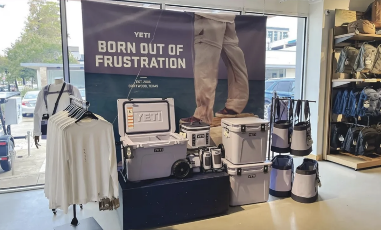
Your permanent point-of-purchase displays are usually larger and are also made from sturdier materials, such as glass, wood, metal, and hard plastics. As these are vendor provided, their logos are often highly visible. It’s important that your product finding signage (overhead or on the floor fixtures), is not the same color or typeface as your largest, permanent POP vendor displays. If your signage matches a well-displayed vendor’s logo, that vendor will be perceived to “own” the store rather than you, the actual owner.
Digital POP displays usually have a digital monitor or LCD screen. I was waiting for my car at a dealership and wandered into their fairly extensive part department. On a shelf around eye level was a small video screen, sound low but hear-able about a computer display glass cleaning product. It was probably 50 seconds long (my attention span on a good day) and within a minute I had bought it for $9.99. It was ten dollars I had zero intention of spending one minute earlier. That was an excellent POP display – short, succinct, priced right, and it addressed a need we all have.
POP displays are a great way to increase sales using the logical adjacency concept. If you have a moveable POP display that works well with another product line, put them together. For example, a chemical for toilets matched with special toilet paper for RVs. This makes it easier for customers to accomplish a task and, it increases their average purchase amount.
Consider Price When Choosing a Fixture
Finally, the power of dump bins cannot be overestimated. These are used for small items or special promotions. Products are often displayed in large quantities, usually at bargain prices. If you are showing full-price items in a dump bin, it’s misleading your customers and they may feel cheated by the implications of the table fixture. Dump bins are freestanding and can be placed in strategic locations, accessed from all sides. Dump bins also provide plenty of space for brand messaging.
Point of Purchase displays on your countertops are smaller and usually contain items priced under $15. Consider some snack items near the checkout area and chocolate for on top of the counter. Even dog treats can sell – just make sure DOG is clear. It could be an unwelcome surprise for a customer who doesn’t read thoroughly.
When you’re working with your vendors and they offer POP displays and fixtures, make sure the displays will fit into your store, try to avoid cardboard unless it’s for inexpensive items, and keep these displays filled to sell. These POP displays have a lot of value!


